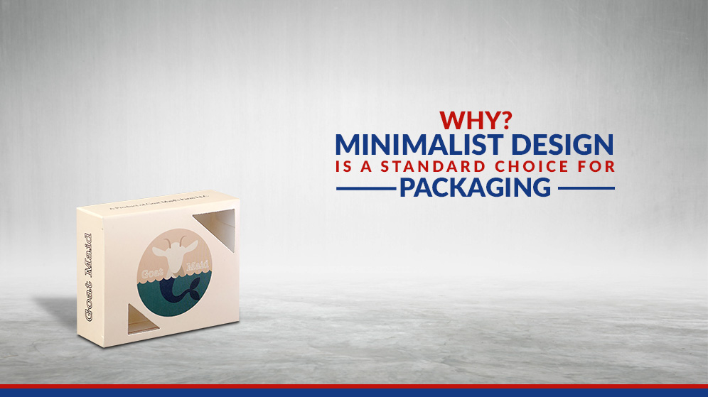
Why Minimalist Design is a Standard Choice for Packaging?

Minimalism is a common trend in various industries, particularly in the packaging industry. By having minimum design elements and arranging them to the striking and long-lasting impression among the consumers. Using a minimalist brand will allow the integrity of the product to shine through.
There are some valid reasons why this trend is popular and let us look at what they are:
- To many Overwhelming Designs in the market:
Consumers, in general, are used to overwhelming and excessive designs. In the modern digital age, we see product promotion everywhere either in videos or images or via digital ads. A study has shown a significant positive correlation between four things i.e. product design, statistics, education and purchase intention. Opting for a minimalist design is a smart move as the market is saturated with over-the-top designs.
The Advantages of the Minimalist Packaging Design are:
Simplistic Product Design: Easily captures customer’s interest and not overload with excessive elements. It retains the appeal in the most basic form.
Easy-To-Relay Product Information: Keep your customers excited by allowing them to read the knowledge in your product packaging. Rather than putting tons of images or patterns, emphasise the proper information that ought to appear in your product label and packaging.
Stand Out from The Rest: By appearing different from the other colourful contemporaries in the shelf your product is likely going get more noticed by the consumers.
Make a great product statement: Embolden your statement without any compromise.
- Perfect Choice for Millennials:
The current generations way used to the internet and other technology trends than the previous generation and it’s no surprise what are current preferences for this generation. In the past, maximalist designs may have their time but in the current time, this trend is well-liked by millennials.
Minimalist product design promotes open communication and conveys your message properly. Simple designs also have a pleasing effect hence why it has a large following.
- Supports Easy Incorporation of Ideas:
There are several examples of poor packaging design that too much graphics, padding or colours. A good designer knows how to balance out elements for the final design, to appear stable and perfect. For minimalist packaging design, it’s a bit easier to work, with only requiring fewer elements to display a complex and intricate design.
It is recommended not to rush your product packaging design because it can be an obstruction for developing mock-ups. Just because the business and development team want to have quick output doesn’t mean hastily coming up with a design that is broad and messed up in the end.
Using a minimalist approach to incorporate your ideas well enough to create a balanced design.
- Cost-Effective Endeavour:
Among the perks of minimalist design also include cost-effective endeavour. Firstly, the overwhelming designs can cost a lot and secondly, cheap and poor production would lead to bad press for the company by taking this shortcut. The minimalist design saves money and retain quality and security. This enables your packaging boxes to be convenient and easier to ship, decreasing the costs in the shipping as well.
- Being Pro-Environment:
Eliminating the extra packaging stuff is also a pro-environment or Eco-friendly endeavour. These practices increase your brand image; credibility & trust form the customer in your company. Investors also love to deal with such businesses, who have policies for Eco-friendliness.
Minimalist packaging has several perks and advantages that benefit your business a lot if you feel interested then try them into your products.
 Apparel Boxes
 Bakery Boxes
 Cosmetics Boxes
 Medicine Boxes
 Retail Boxes